● Introduction to Stock Trends
The trend is a very simple, yet powerful concept in technical analysis. Often the first thing a chartist does is determine whether stock trends are up, down or neither.
The stock trend is simply the prevailing momentum in whatever stock you’re looking at. Trend trading stocks is simply trading in the direction of that momentum. The following are the most common definitions of stock trends:
Uptrend: A succession of higher highs and higher lows.
Downtrend: A succession of lower highs and lower lows.
If neither an uptrend nor downtrend is occurring, then a congestion pattern (going sideways) is occurring, which we’ll review in a bit.
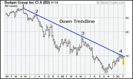
Fig 1.6 below is a very basic example of a down trend:
Fig 1.8 Click to Enlarge. Chart courtesy of StockCharts.com
As you can see, there’s a succession of lower highs marked 1, 2, 3 and 4.
Now let’s take a look at a basic uptrend in Fig 1.7 below.
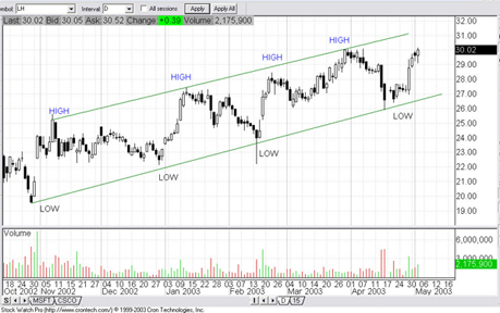
Fig 1.7 Click to Enlarge.
The above chart is a candlestick chart of Laboratory Corp. (LH). As you can see, it’s in a strong upward trend, marked by 4 higher lows and 4 higher highs.
Please note that the above stock chart appears different from the other examples because it was generated by a different stock charting program, in this case, Stock Watch Pro. Every stock charting program will look slightly different, but the basics are usually the same. Here the timeframe, near the top left, is now marked with a “D” for daily in the “interval” box. There’s also a picture of the volume at the bottom. The rest of the chart examples in this guide are all from the same stock charting program.
● Stock Trend Reversals
So now you know how to identify up and down trends, but how do you know when stock trends have ended or reversed?
As you’ll recall, the definition of a downtrend is a succession of lower highs and lower lows. So the way we identify that the downtrend has ended, generally speaking, is if the succession of lower highs is broken, i.e., there’s a higher high.
Fig 1.8 below is an example of the Dow Jones Index’s downtrend broken by a higher high.
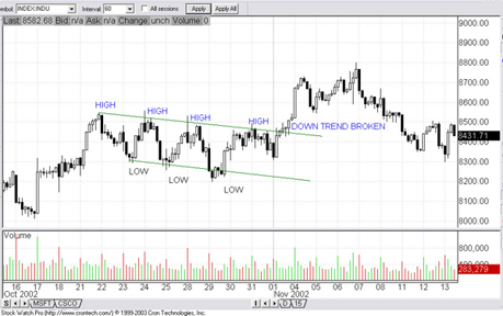
Fig 1.8 Click to Enlarge.
There was a very clean downtrend from around October 21st until the 1st of November. The downtrend is eventually broken around the 4th of November when a higher high is made.
● Redrawing Trend Lines
All the examples of up and down trends so far have been pretty clean. They fit nicely into an upward or downward channel. In reality, stock trends aren’t usually that clean, and you’ll often have to redraw trend lines.
One common reason you’ll have to redraw trend lines is because stock trends often intensify.
In figure 1.9 below, Cisco Systems (CSCO) was in a strong up trend from March 1995 until September 1995. During that time, the up trend intensified, making it necessary to redraw the trend lines.
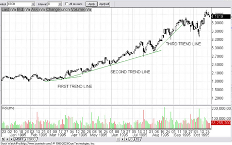
Fig 1.9 Click to Enlarge.
Helpful Hint: The more intense a trend, the less likely the trend is to maintain itself at such an intense slope. If you notice a particularly intense trend start to fail, don’t be too quick to think the trend has reversed. Often sharply sloped, intense trends revert back to a calm slope while still maintaining the same direction. Ideally, though, you only want to trade stocks that follow clear, steady trend lines.
● Final Words on Stock Trends
There’s an old cliché on Wall Street-- “The trend is your friend.” This phrase is extremely important in technical analysis. If you remember nothing else from this guide, remember that saying.
The first thing you should do when analyzing a chart is to figure out the stock trend. If you cannot figure out the trend, then don’t bet up or down. There’s always something out there trending. Find it and trade it, because that’s usually where the most money is to be made. Although you can trade congestion patterns as they bounce up and down, the big moves happen in trends. Going with the trend is such a simple concept, but most people don’t follow it.
● Lessons Learned
As we all know, the technology laden NASDAQ Index exploded from the mid to late 90’s, only to implode around late 2000. Many people made insane amounts of money, but gave it all back just as quickly when the bubble popped. Simply following the trend would have taken one out of the market before the blood bath started.
Fig 1.9 below is a weekly chart of the NASDAQ Index in its heyday from 1994 to 1999. Notice the near-perfect trend.
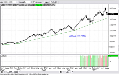
Fig 1.9 Click to Enlarge.
Below is a larger chart of the NASDAQ Index that also shows a few years later.
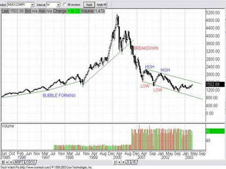
Fig 2.0 Click to Enlarge.
One can debate on the exact moment the up trend ended, but clearly by late 2000 the up trend was breaking down. It was also abundantly clear that by the beginning of 2002 a down trend had formed, marked by two successive lower highs and lower lows.
Simply following the trend would have spared people quite a few years of pain, or even better, the opportunity to profit through shorting.
|