● Parts of Charts
Click to Enlarge. Chart courtesy of StockCharts.com
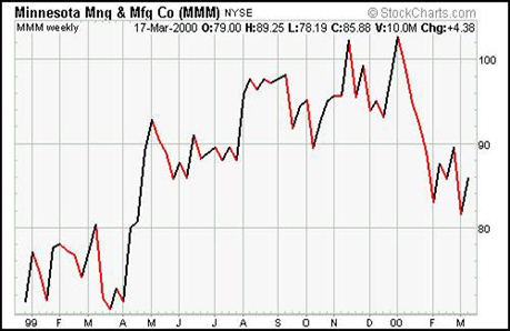
Fig 1.1 above is a stock chart in its simplest form. This section will go over each part to ensure understanding.
In the upper left corner is the name of the company, Minnesota Mining & Manufacturing Corp, with its ticker symbol (MMM) and the exchange it’s traded on, the NYSE. [Hint: Depending on the charting software, the location and appearance of information can slightly vary.]
Price Movement: The stock prices for MMM are represented with a red and black line. Each point on the line corresponds to a closing price on the right vertical axis. Red coloring is used when the stock price goes down; black coloring is used when the stock price goes up. (Please note-- chartists almost never use a plain line to represent the stock prices. We are only using a line chart at first to keep things simple. Later chapters explain other types of stock charts.)
Price Axis: On the right vertical axis is the stock price, in this case marked 80, 90, and 100.
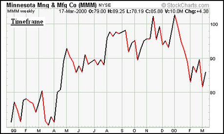
Fig 1.1 Click to Enlarge. Chart courtesy of StockCharts.com
Timeframe: In the upper left corner is the timeframe. This is extremely important. In this case, the chart is a weekly chart, marked by “weekly” next to the MMM ticker. Therefore, each point on the line represents one week’s closing price, i.e., where the stock closed at the end of the day on Friday or whatever day the week trading ended. Stock charts can be in any timeframe. For example, if we wanted a shorter timeframe of the above chart, we could change it to daily, making each point on the line a daily closing price instead of a weekly closing price.

Fig 1.2
Price Details: Right below the MMM stock ticker symbol are the details about price which have been enlarged in Fig. 1.2. (Looking at these is easier than taking a ruler to the chart to figure exact numbers)
First there’s the date, then there’s the opening price (O), the high price (H), the low price (L), the closing price (C), the volume (V), and the Change (Chg). These details normally apply to any point on the chart that you click on. For this handbook, though, most prices will describe the last point, or farthest right, on the chart.
Open (O) means the opening price for whatever timeframe you’re using. In Fig 1.1, because it’s a weekly chart, open means the stock’s opening price at the start of the week. For the last week on the chart, the opening price was $79. (Notice that although the stock opened for the week at $79, the line never goes as low as $79. Why? That’s because in line stock charts, only the close is plotted, meaning any movement lower or higher than the close won’t be shown...that’s the problem with line charts.)
High (H) means the highest price that occurred during whatever timeframe you are using. In Fig 1.1, it’s a weekly chart, so this means that during the entire last week that MMM traded, $89.25 was the highest price that it reached. Again, because of this is a simple line chart, the line never actually touches $89.25 during the last week. The line stops at $85.88, where MMM closed for the week.
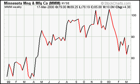
Fig 1.1 Click to Enlarge. Chart courtesy of StockCharts.com

Fig 1.2
Low (L) means the lowest price during whatever timeframe you are using.
Close (C) means the close of whatever timeframe you are using. For the above chart, close means at the end of the last week, MMM finished at $85.88.
Volume (V) means the total volume during your set timeframe. Using the above example, during the last week on the chart, 10 million shares of MMM traded.
Change (Chg) means the change from the last close to the one before it. From the close of the last week, to this week’s close, MMM gained $4.38.
● Which Timeframe to Pick?
How do you decide among daily charts, weekly charts or monthly charts? The answer is that it depends on what you’re trying to do. If you are planning on holding a stock for a few days, then you should use a daily stock chart; a few weeks, a weekly chart, etc. It is helpful, however, to have the bigger picture in mind even if you plan on trading short term so you don’t get tunnel vision. Try to look at several timeframes when learning technical analysis.
● What’s Wrong with Line Charts
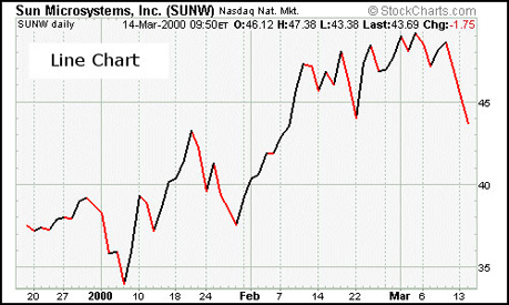
Fig 1.3 Click to Enlarge. Chart courtesy of StockCharts.com
As was mentioned before, chartists almost never use line stock charts like the ones shown before and in Fig 1.3 above—it was only used in this intro for simplicity’ sake.
Remember how a stock’s price could go lower or higher than the closing price before it closes, but the chart wouldn’t show it? That’s the problem with line charts; they only show closing prices, not highs and lows.
To get more information, most users of technical analysis use either bar charts or candlestick charts, which are simply different ways of showing stock prices. Bar and candlestick charts are more accurate because they visually represent the close, the high and the low, making them superior stock chart formats. Continue reading to learn more about bar and candlestick charts.
Bar Charts
● Introduction to Bar Charts
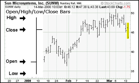
Fig 1.4 Click to Enlarge. Chart courtesy of StockCharts.com
Fig 1.4 above is a simple example of a bar chart for Sun Microsystems (SUNW). Pretty much all bar charts will look like it. On left is an enlarged bar showing its properties. As you can see, if the lower horizontal bar is facing left, and the upper horizontal bar is facing right, then it’s an up bar; the inverse would be a down bar. As you can tell, you don’t need to look at the detailed price information at the top to see highs, lows, etc. because the bars themselves show them. However, it’s still useful to have the detailed price information available because sometimes it’s difficult to eye up the exact numbers.
Let’s take an even closer look at the stock chart above to review what we’ve already learned. If you look at the upper left corner of the chart, right below the “Sun Microsystems, Inc.” label, you’ll see the words, “SUNW daily.” That is the timeframe, in this case daily, meaning that each bar on the chart represents one day.
If you look at the far right of the chart you’ll see the last bar highlighted in yellow which corresponds to March 14th’s stock prices. You’ll notice that the bottom horizontal bar is facing right, and the above one left. That means March 14th was a down day, i.e. SUNW finished at a lower price than it opened. The upper horizontal bar is the opening price, and the lower horizontal bar is the closing price. If you’d like the precise numbers for the high, low and close, you can still refer to the detailed price information at the upper part of the chart: On March 14, 2002, SUNW opened (O) at $46.12, had a high (H) of $47.38, had a low (L) of $43.38 and closed (referred to as “last” when it’s the last bar on the chart) at $43.69.
Helpful Hint: Change (chg) refers to the difference between yesterday’s closing price and today’s, not the difference between today’s open to today’s close.
Japanese Candlestick Charts
● Introduction to Japanese Candlestick Charts
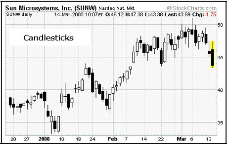
Fig 1.5 Click to Enlarge. Chart courtesy of StockCharts.com
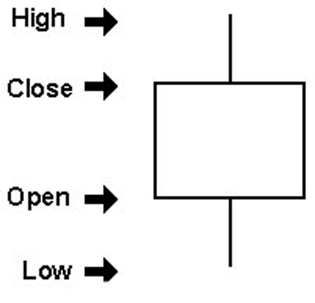 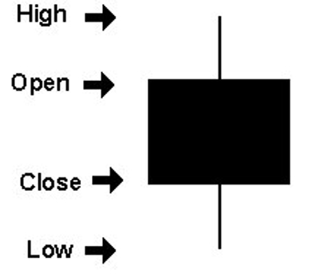
Fig 1.6 Chart courtesy of StockCharts.com
Japanese Candlestick charts are just another way of visually representing stock prices. They’re called “Japanese candlestick charts” because they originated in Japan some 300 years ago. Many people find them easier to read than bar charts.
Figure 1.5 above is the same daily chart of SUNW that you just saw, but now it’s in a candlestick chart. White candles are up days, and black candles are down days. If it’s a white candle, then the bottom of the candle body is the opening price, and the top of the candle body is the closing price. For black candles, the top of the candle body is the open, and the bottom of the candle body is the close. The lines (or candle wicks) extending from the top of the candlesticks are the highest price for that period, and from the bottom of the candles the lowest prices for that period. Studying fig 1.6 gives a good understanding of candlestick basics.
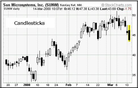
Fig 1.7 Click to Enlarge. Chart courtesy of StockCharts.com
If you look at the far right of the chart you’ll see the last bar highlighted in yellow which corresponds to March 14th’s price action. You’ll notice that it’s a black bar. That means March 14th was a down day, i.e. SUNW finished at a lower price than it opened. The top of the candle body is the opening price, and the bottom of the candlestick body is the closing price. The line extending from the top of the candle is the high, or highest the stock went during that day. The line extending from the bottom is the low, or lowest price of the day. Again, if you’d like the precise numbers for the high, low and close, you can refer to the detailed price action information at the upper part of the chart.
Candlestick charts have become so popular that they have their own subdivision of technical analysis. There are entire books written exclusively on how to use candlestick charts. This guide won’t go into any of the complex ways of using them, but it will almost exclusively use candlestick charts from now on, as they’re often easier for beginners to understand. |