| ● What Are Chart Patterns?
Technicians have identified a variety of chart patterns that occur. These patterns or formations represent the more subjective aspects of technical analysis; nonetheless, technical analysis of chart patterns is useful to learn about, if for no other reason than other people are looking for the same patterns.
A note on patterns: There are endless numbers of chart patterns out there. This guide will only detail widely-accepted, common patterns. Keep in mind that this is not an exact science. The patterns you will see follow general guidelines, but aren’t rigidly defined. For now, just try to understand the basics of each pattern.
● Gap Patterns
Sometimes good or bad news will come out when the stock market is closed, creating a severe imbalance of buyers or sellers. The result is that when the stock finally opens for trading, it will jump up or down, leaving a hole in the chart. Technicians call this occurrence a gap.
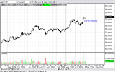
In Figure 2.3 below, we see Amazon.com’s (AMZN) stock gap up when it surprised the public with better than expected earnings.
Fig 2.3 Click to Enlarge.
Amazon released their good earnings news after the stock market closed, creating a huge imbalance of buyers the following morning. When the stock finally opened for trading, it gapped up.
Gaps are important for two reasons:
(1) They’re a strong sign of strength or weakness, and (2) they tend to get filled. Gaps are usually caused by either really good or really bad news, so they’re usually significant patterns.
● Flag and Pennant Patterns
Flag and pennant patterns are continuation patterns, meaning that after they occur, usually price continues to move in the same direction as the prevailing trend. They represent temporary congestion within stock trends. If a flag and pennant pattern occurs, and the price successfully breaks out of it, then it can be taken as confirmation that the trend has continued.
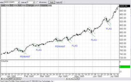
Fig 2.4 Click to Enlarge.
As you can see in figure 2.4 above, the NASDAQ continued up from January to July 1995. Within the trend, there were periods of congestion called flags and pennants.
You may be unclear about the difference between flags and pennants. Well…so are most people. It doesn’t really matter whether something is a flag or a pennant. The two are interchangeable from a practical standpoint. The important thing to know is that they are good times to enter a trend, and if they fail, they can mark the end of a trend.
Triangle Patterns
Some traders refer to triangles as “coils” because the trading action gets tighter and tighter until the market breaks out suddenly and powerfully. What happens is that buyers and sellers become more and more unsure about where the stock is going until, finally, the stock moves significantly, releasing all the stored energy like a coiled spring .
There are three types of triangle patterns: Ascending triangles, descending triangles, and symmetrical triangles.
● Ascending Triangles
An ascending triangle is a triangle that has a flat top with a rising bottom. It is generally regarded as a bullish pattern.
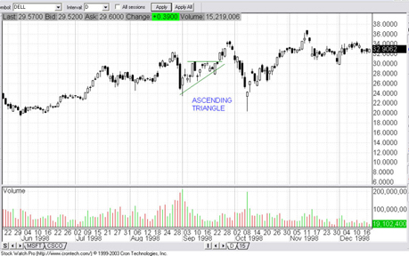
Fig 2.5 Click to Enlarge.
Above we sellers maintaining steady resistance at the flat top of the triangle, yet buyers were becoming more and more aggressive, creating an upward bottom for the triangle. Buying pressure finally broke through the sellers’ resistance at the top of the triangle.
● Descending Triangles
A descending triangle is a triangle with a flat bottom and a descending top. It’s generally regarded as a bearish pattern.
Below is an example in Amazon.com (AMZN):
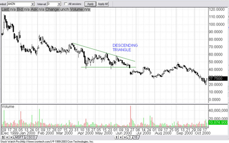
Fig 2.6 Click to Enlarge.
From April to late June, buyers kept up a steady support level around $42, while sellers became more and more anxious, selling sooner and sooner, causing the price to go further and further down. Finally in late June, selling pressure mounted until the stock broke down.
● Symmetrical Triangles
Symmetrical triangles aren’t regarded as bullish or bearish; they’re simply regarded as continuation patterns.
Below is an example in Exxon Mobil (XOM):
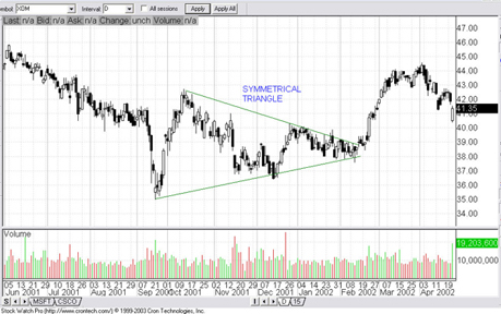
Fig 2.7 Click to Enlarge.
Both buyers and sellers became more anxious from Sept 2001 until February 2002 as the price action become tighter and tighter. Finally XOM breaks out like a coiled spring to the upside.
A Final Note on Triangles: While ascending triangles are generally regarded as bullish, and descending triangles are generally regarded as bearish, what’s more important is the direction of the breakout. If a stock breaks out to the upside, it’s bullish. Forget what kind of triangle it was. The same goes for downside breaks.
● Double Bottom Patterns
Double bottoms are regarded as reversal patterns, meaning that when they occur, the trend is likely to reverse.
In a double bottom, a downtrend is halted by two support levels. These bottoms indicate that there is strong support to protect against any further downside.
In Fig 2.8 below, the Dow Jones Industrial Index was in a down trend from July 1998 until October 1999 when the second bottom occurred. After that point, the trend reversed and an up trend began.
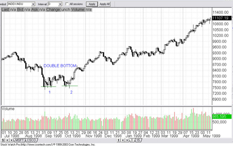
Fig 2.8 Click to Enlarge.
Helpful Hint: Double bottoms are sometimes called “W” patterns because of an upswing in between the two bottoms, like in the chart above.
● Double Top Patterns
Double tops are the same as double bottoms, but are regarded as bearish reversal patterns instead of bullish.
In figure 2.9 below, BJ Services Co. (BJS) was in an up trend from around September 1995 until October 1997. The trend reversal is confirmed by the second top which occurred around April 1998. From April 1998, a downtrend persists until around October of the same year.
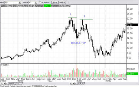
Fig 2.9 Click to Enlarge.
Helpful Hints:
- Double tops are also sometimes called “M” patterns because of the downswing between the two tops, like in the chart above.
- The tops or bottoms don’t have to be at the exact same level. As in the chart above, an approximation is fine.
- Two isn’t a magic number. There can be double, triple, even quadruple top/bottom patterns. The more tops or bottoms that form, the stronger the pattern is.
● Head and Shoulders Patterns
Like the double top/bottom patterns, the head and shoulders pattern is also a reversal pattern. The head and shoulders pattern is quite well known probably because William Buckley popularized it in his publication, Investor’s Business Daily.
The head and shoulders pattern consists of a left shoulder, a right shoulder, a head and a baseline (also called a “neckline”). Figure 3.0 below is an example in Seitel Inc. (SEI):
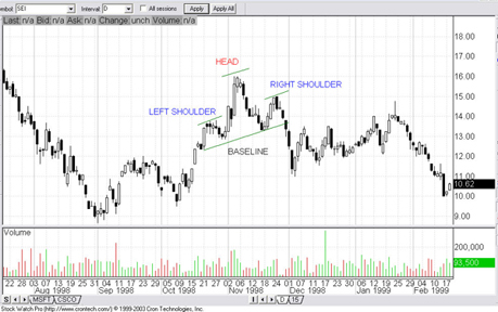
Fig 3.0 Click to Enlarge.
In the case above, the head and shoulders pattern had completely formed by late November 1998. When the price broke below the baseline at the end of November, it was an extremely bearish sign, and the price subsequently broke down.
With all head and shoulder patterns, the moment of potential reversal is when the price breaks through the baseline.
Helpful Hint: The more complex the pattern, the more subjective it can be to identify it. Such is the case with head and shoulders patterns. Some have attempted to assign precise rules to them while others are more lax. Ultimately you will have to decide on your own particular criteria for identifying head and shoulders patterns. Just remember to keep in mind the basic four parts, and you should be fine. |